Faster than any other technology in history, mobile is transforming the way companies sell to their customers. Because of this break-neck pace, it has become difficult for organizations to keep up with mobile standards and trends. In fact, beginning in April of 2015, Google announced that it would use mobile-friendliness as a ranking signal in search results, rewarding websites that are fully optimized for mobile platforms. The company has even gone so far as to provide developers with a test site that allows them to evaluate the “mobile-friendliness” of their creations.
To make matters worse, terms such as Adaptive Web Design (AWD), Responsive Web Design (RWD), HTML5 and native app development have added to the confusion as enterprises struggle to provide an optimal mobile experience for their customers, while keeping website maintenance costs low.
When building a mobile strategy, it is important to take into consideration the explosive growth of smartphones, tablets and wearables, as well as other mobile devices used in-store, and determine how they impact all the sales channels currently offered. When you think of it, every consumer sales experience can be delivered through a mobile device such as POS, kiosk and, most importantly, ecommerce.
Of all the channels, ecommerce provides the most technical approach for execution. Each of these options has its pros and cons, and it is imperative that you find the one that matches your customers’ shopping habits without breaking the bank. In this article, we will explore and define the three fastest-growing trends for addressing e-commerce through the mobile Web and provide the pros and cons for RWD, AWD and a blended approach known as RESS.
Three Approaches: Responsive, Adaptive, Blended
Today, there are three different ways to build a site that works well on multiple devices: responsive Web design (client-side scripting), adaptive Web design (with server-side scripting) or blended Web design (responsive with server-side components). What’s the difference? What should you use and why?
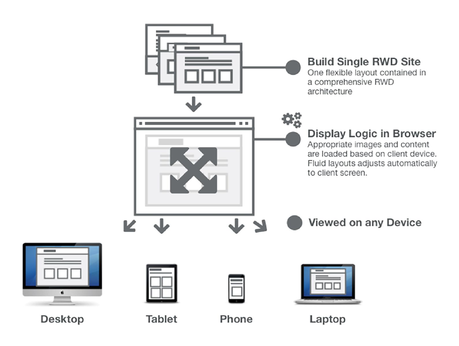
Responsive Web Design
Responsive Web Design is a great way to design and develop a single ?uid website that will respond to the user’s device, allowing a well-designed experience to work on a wide range of screen sizes—from the smallest smart phone to the largest desktop, and every tablet or laptop in between.
RWD is a client-side approach that uses CSS and Java Script to modify the presentation of pages to fit a user’s screen. The technology behind RWD is built into the front-end of the website and executed on the user’s device. Server-side changes are not needed and no redirects or third-parties are required.
RWD Pros & Cons
Pros
- More consistent user experience: RWD can deliver a seamless user experience across devices. It’s all the same site - it is simply displayed in a way that’s responsive to different devices. A consistent experience can help you reinforce a positive brand impression and drive higher conversions.
- Better business reporting and Web analytics: Reporting and analytics are easier to manage on a single RWD site. There’s no need to combine data from multiple sites.
- Better search performance: Having just one URL for each page can drive higher search rankings and avoid the SEO dilution that can happen when you’ve got multiple sites serving the same content.
- More efficient design and development: Business, design and development teams are focused on one project, optimizing your team’s efficiency and creating a simplified calendar of release cycles.
- Your site keeps up with change: Flexible design does not require re-work when new devices are released (larger phones, smaller tablets, etc.). This means you’ve got a future-proof design and better reach to non-desktop devices.
- Easier back-end integration: User accounts and data do not require complicated synchronization across devices. A logged-in user sees the same account on every device.
Cons
- Limited talent pool: RWD is a new technique. There’s a limited pool of developers who can do it well.
- Steep learning curve: Designing for RWD can be challenging. If your developers aren’t well versed in it, it can be tough to learn.
- Design and development need to work together: Process changes require more collaboration between design and development teams.
- Slow performance: If responsive images are not used and the site is not built correctly for all screens, the site can be slow on mobile devices.
- Increased development and QA time: When compared to a single static site.
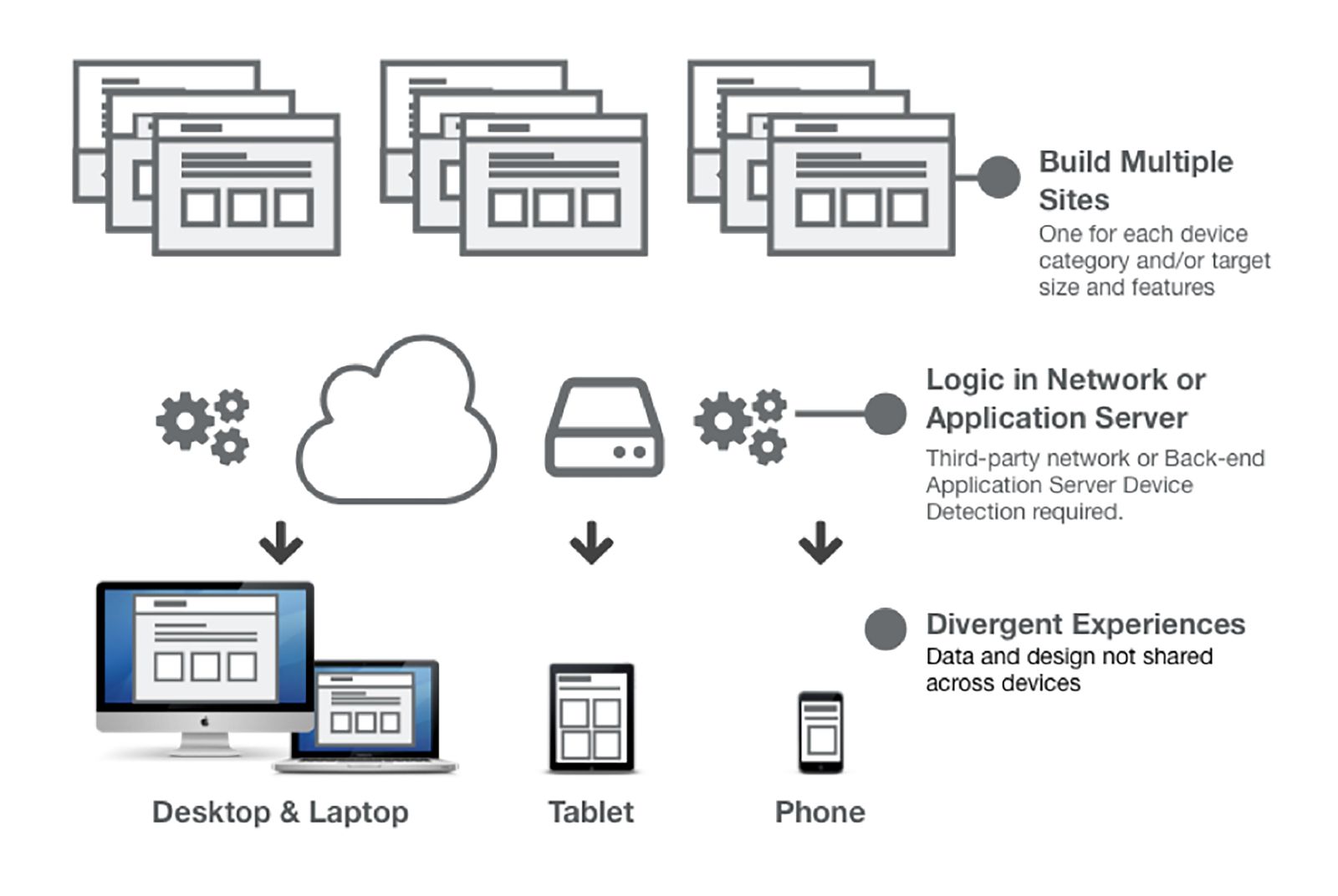
Adaptive Web Design
Adaptive Web Design is the server-side approach. In AWD, users on different devices are served different content. For example, a company sends users on mobile devices to a different domain that serves content from a different module. By sending different content, the user experience can differ significantly from the desktop site.
AWD Pros & Cons
Pros
- More familiar: Building static sites one by one is more familiar to business, design and development teams.
- Easier outsourcing: Outsourcing to a third party can be cost-effective if non-desktop segments are not expected to generate revenue or if a seamless user experience is not a priority.
- Better performance: Site performance is optimized to each site separately, resulting in faster load times for mobile devices.
- Different experiences on different devices: While delivering a consistent experience on all platforms has real benefits, in some instances, you might want to offer different experiences to users on different devices. With AWD, this is easy to do.
Cons
- More to build: Business, design and development teams’ attention is split on multiple sites and projects.
- Tough to coordinate: Project work must be done in parallel with various teams (mobile site team, desktop site team, etc.).
- More to maintain: All maintenance and release work is multiplied by the number of sites.
- Complicated reporting and analytics: Business reporting and Web analytics are in multiple systems and require business resources to gather and combine data manually.
- Inconsistent user experiences: It’s pretty difficult to keep everything in sync. You’re almost guaranteed to have different user experiences on different devices.
- Increased development and QA time: When compared to a single static site.
- Bad SEO effects: When content is split across multiple sites/URLs.
- New devices mean more development: New devices in the market may require new sites or re-designs.
- Tougher back-end integration: User accounts and data are not shared across sites without significant engineering effort.
- Challenge with users on multiple devices at once: Activity across devices requires engineering effort to handle complex interactions (mobile URL opened on desktop, or vice versa).
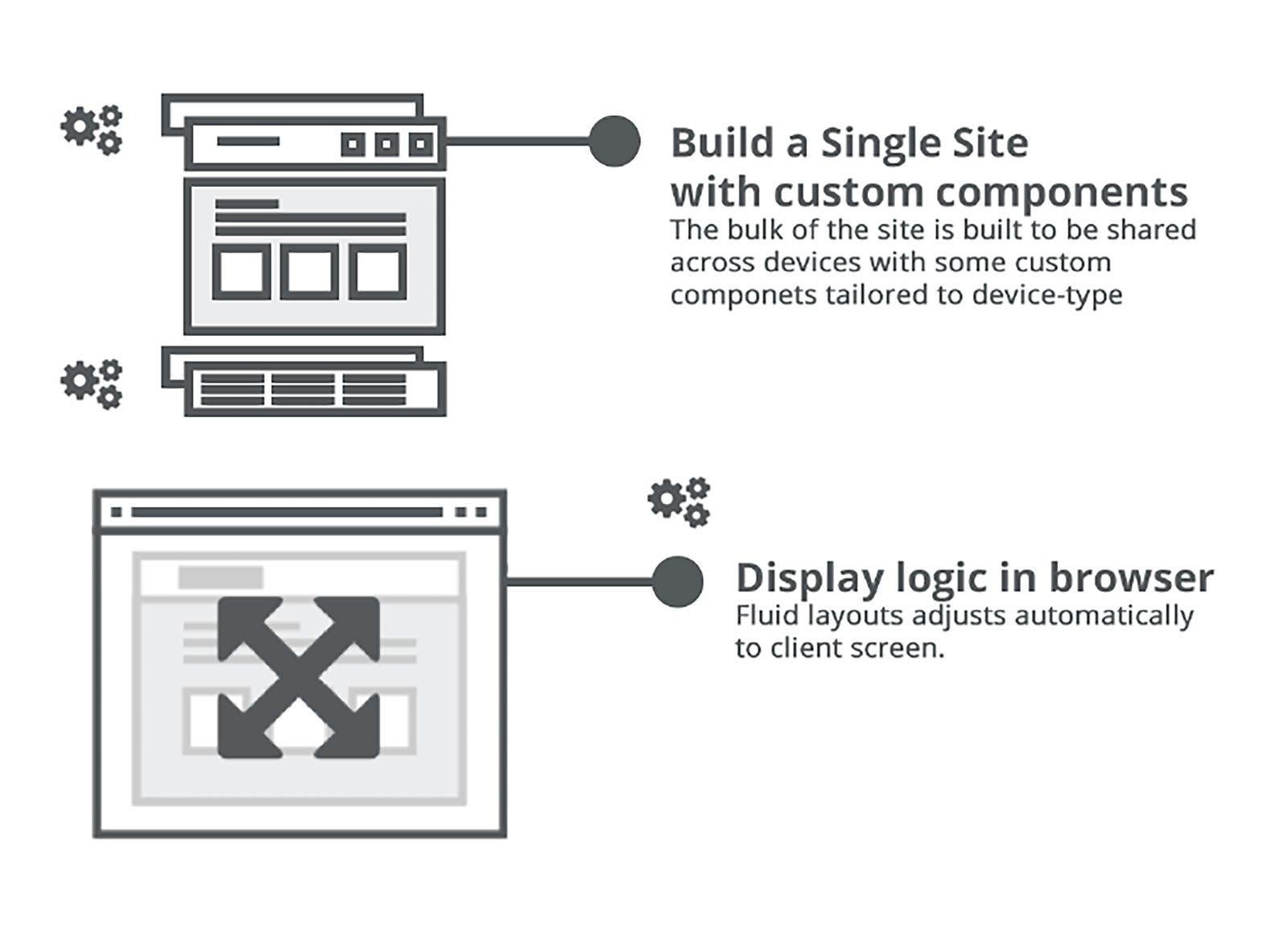
Blended Web Design: Responsive With Server Side Components
The final approach is to blend both responsive design and adaptive delivery; this is called Responsive with Server Side Components (RESS). For example, using an RESS approach, users on mobile devices can receive a header and footer that are customized to their device, but there’s still just one website to serve multiple devices. This decreases the overall footprint of the download and can reduce the processing that has to happen on the client. Essentially, RESS combines the best of RWD and AWD.
Pros
- One site to build and maintain: With RESS, it’s just one site – just like RWD – so if you have the skills, it’s simpler to build and maintain and it delivers a consistent user experience across all devices.
- Better performance: Having custom components delivered to different devices can reduce the client-side processing burden and improve performance.
Con
- Still limited talent pool: If the talent pool for RWD is limited, the number of developers who’ve mastered RESS is even more limited. This will change over time, but given the benefits of RESS development, it might be worth going the extra mile to find developers who have mastered this new approach.
Conclusion
Each of the options above has its pros and cons, but for most businesses, RWD offers the best bang for the buck. Since there are few companies with the capital to invest in constant maintenance of multiple code bases, RWD offers an efficient and economical way of optimizing your current website to meet the demands of ever-changing screen sizes and resolutions. Many of the drawbacks of the RWD approach can be greatly minimized or completely eliminated with the right team using the RWD framework.
Additional RWD benefits include: reduced development costs, easier integration, simplified maintenance and a consistent user experience—without running into the performance issues that can plague client-side processing.
If you’ve got primarily tablet-based traffic and limited resources, an AWD approach might be a reasonable stopgap before making the move to RWD or RESS in the future. Although an RESS approach offers additional benefits it can be more costly and requires a special skill set to be executed correctly.
In the end, it is important to think strategically about your online presence. By integrating mobility into your overall marketing efforts and careful consideration of the myriad devices your customers are using to access your online presence, you can better deliver the engaging mobile experience consumers expect.
Visit here to download the entire white paper.
Edited by
Dominick Sorrentino
 QUICK LINKS


